Designing clear and efficient goal and task screens in mobile apps can dramatically impact user engagement and productivity. By focusing on usability and intuitive design, developers can help users achieve more with fewer distractions. Properly implemented, task manager UI design concepts can set a solid foundation for productive app experiences and high user satisfaction.
Effective goal and task screens are not just about visual appeal. Their success relies on simplicity, navigation, and understanding the context of mobile usage. Ensuring that every interaction contributes to productivity and focus helps users quickly adopt and repeatedly use the app, boosting overall retention and satisfaction.
When these design elements come together, the result is an interface that feels almost invisible, letting users move effortlessly from one action to another. Good mobile UX is about anticipation, thoughtful feedback, and respecting user expectations. Guided design helps prevent errors and leads to a more positive user relationship with your app.
Incorporating tested principles and paying attention to platform-specific guidelines ensures that your goal and task screens meet contemporary standards and user needs. By learning from established practices and adjusting for your target audience, designers can bridge the gap between intention and action with ease.
1. Prioritize One Task Per Screen
One of the most effective strategies for mobile design is reducing cognitive load by letting each screen serve a single, easily defined purpose. Overloading a screen with multiple goals or unrelated actions only invites confusion. For example, a dedicated task creation screen should make adding a new task effortless and distraction-free. Keeping actions contextual and direct improves focus and enables more predictable behavior, leading to higher task completion rates. Additional insights into task screens can be found at Mobbin’s collection of task manager UI examples.
2. Simplify Navigation
Clear navigation is fundamental for a great user experience. Using recognizable navigation elements, such as a bottom tab bar, provides quick access to the main areas of the app and reduces friction. This design choice works best for apps with a limited number of key destinations. Avoid overcomplicating navigation with too many levels or hidden menus; place important sections front and center so users can move fluidly through their workflow.
3. Design for Thumb-Friendly Interactions
Most users interact with their mobile devices single-handedly, so interactive elements must be comfortably accessible with a thumb. By placing vital actions and navigation within the lower portion of the screen, users do not have to stretch or shift their grip. This ergonomic principle enhances usability and decreases user fatigue, making the app more likely to integrate into daily use.
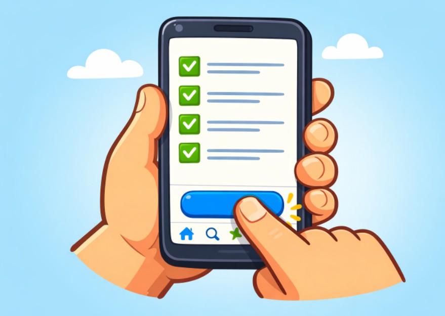
4. Ensure Adequate Touch Targets
Buttons and interactive elements must be large enough for easy tapping. Apple’s Human Interface Guidelines recommend a minimum touch target of 44 by 44 points, while Google’s Material Design suggests 48 by 48 dp. Smaller targets can result in missed taps or accidental inputs, contributing to user frustration. Maintaining the right touch area size and spacing is an essential aspect of accessibility for users of all ages and abilities.
5. Provide Clear Visual Feedback
Users expect instant confirmation when they interact with app elements. Incorporating micro-interactions, such as subtle button animations or progress indicators, assures users that the app is responding to their commands. These dynamic cues reinforce satisfaction by bridging the gap between action and result, especially in task-oriented interfaces. For more information on micro-interactions, consider reading this article on micro-interactions in UX design from Wix Studio.
6. Maintain Consistency with Platform Guidelines
Each mobile platform provides its own set of UI guidelines. Respecting these conventions ensures your app feels natural and consistent for users, helping reduce the learning curve and preventing confusion. For example, iOS users are accustomed to navigation patterns distinct from Android. Following the platform’s human interface guidelines or material design specifications contributes to a seamless and familiar interaction flow.
7. Implement Progressive Onboarding
Gradually introducing app features as needed lets users learn in context, improving retention and comprehension. Rather than overwhelming new users with dense tutorials or walkthroughs upfront, progressive onboarding reduces abandonment and encourages exploration at a comfortable pace. Contextual reminders and hints ensure users realize the full potential of goal and task management tools.
8. Optimize Performance and Responsiveness
Quick load times and immediate responses are non-negotiable for engaging goal and task screens. Slow performance will rapidly erode trust, disrupt concentration, and lead to app uninstalls. Regularly test across devices and optimize code to ensure smooth animations, instant feedback, and short request cycles. Responsiveness, especially for productivity tools, is a primary driver of user loyalty and repeated engagement.
Focusing on clarity, speed, and ease of use in your goal and task screen design will create a mobile app experience that truly empowers users. Adhering to these best practices not only fosters retention but also cultivates a reputation for quality and dependability in the app marketplace.