
Designing effective mobile messaging interfaces demands careful attention to user habits and expectations. A well-executed messaging UI not only enhances communication but also fosters user retention and satisfaction. Leveraging proven design patterns can streamline development and uplift the end-user experience. Exploring email app UI designs can inspire modern solutions for more intuitive navigation and aesthetic appeal.
Mobile users expect seamless, speedy conversations, plus easy management of message threads and quick access to key actions. Each design choice, from layout to interactive elements, impacts usability and engagement. As user needs evolve, understanding essential patterns is key to building a messaging app that feels both familiar and delightful to use.
Whether building for iOS or Android, seeing real-world examples helps ground best practices in real-world success. Well-chosen design patterns reduce cognitive load, simplify navigation, and ensure a friendly, efficient experience for every user.
By prioritizing core usability principles and choosing the right interaction models, you can build a powerful messaging UI that supports both everyday communication and power users alike.
Bottom Navigation Bar
The bottom navigation bar is a staple for modern messaging apps. By placing primary navigation at the bottom edge of the screen, designers ensure that essential sections, such as Chats, Contacts, and Settings, remain easily thumb-reachable. This placement supports natural, one-handed use and minimizes time spent searching for important functions. Limiting the main sections to three to five items prevents confusion and keeps the interface visually clean, facilitating smooth transitions between screens.
Card-Based Layouts
Card-based layouts segment information into distinct, touch-friendly components. In messaging apps, cards can represent message threads, contact profiles, or notifications. This modular format encourages easy scanning, clear separation of topics, and more intuitive content interactions. Each card typically represents a single idea or action, whether it’s a conversation summary or an incoming media attachment, which helps users quickly locate what they need. Well-structured cards also make it easier to introduce swipe actions for archiving or starring messages, enhancing efficiency and delight.
For a deeper look at why card-based designs work so well for organizing content and actions, the Smashing Magazine guide on card-based UIs offers valuable insights.
Interactive Content Layers
Interactive content layers add versatility by offering context-aware overlays or panels. With a tap or swipe gesture, users can preview images, view contact information, or see message details without leaving the main chat screen. This depth of interaction avoids disrupting the main flow and helps maintain user orientation within the app. Design choices like slide-up panels, expandable message previews, or quick-reply fields empower users to access deeper features just when they need them, without distracting from the thread view.
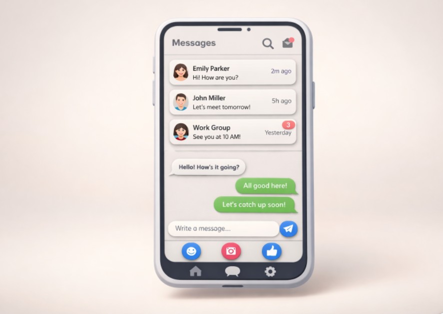
Circles for Action Buttons
Circular action buttons are widely adopted in mobile messaging apps for their ergonomic advantages. Their shape closely matches the natural press area of a fingertip, making it easier to tap with accuracy. Floating circular buttons are often used for core actions like composing a new message or recording a voice note. The simplicity of a bold, circular button cuts through visual clutter, providing an immediately recognizable cue for high-priority actions. This approach also allows for effective use of brand colors and playful iconography, enhancing the emotional appeal of the interface.
Hamburger Menu
The hamburger menu is an icon-based control consisting of three horizontal lines. It offers a discreet location for non-essential or less frequently accessed sections, such as archives, settings, or app help. Selecting the hamburger expands a side panel with expanded navigation, preserving valuable screen real estate for the primary messaging function. Apps targeting power users, or those with a significant feature set, benefit from the organizational efficiency this pattern provides, ensuring that secondary features do not clutter the main screen.
Tabbed Navigation
Tabbed navigation offers another intuitive strategy for managing multiple app sections. Tabs can be positioned at the top or bottom and help users flip between categories like Chat, Groups, and Calls with minimal friction. This layout shines in applications where users frequently toggle between two or three main functions. Each tab should have clear labeling and distinct icons to aid fast recognition and muscle memory, minimizing the thinking required to move around the app. According to Nielsen Norman Group’s research, tabbed navigation reduces interaction cost and supports intuitive mental models.
Micro-Interactions
Micro-interactions are brief, subtle animations or feedback cues that respond to user actions. These might include animated message bubbles when a message is sent, gentle vibrations when a new notification arrives, or a tick mark appearing as a message is delivered and read. Responsive micro-interactions create a more rewarding and polished experience, assuring users that their actions have triggered results. These design flourishes are essential for communicating system status and reducing uncertainty in real time.
Progressive Disclosure
Progressive disclosure guides users through complex information step by step. In mobile messaging, this might mean surfacing only the most relevant controls up front, then revealing advanced search, mute options, or detailed message info through secondary actions like long-press or separate screens. This keeps overload at bay and caters to both novice and expert users. By serving just the right controls for the moment, progressive disclosure ensures a messaging app stays approachable even as feature sets expand.
Adopting the right design patterns for mobile messaging screens can transform how users interact with your application. Whether you prioritize efficient navigation, visually distinct actions, or layered context, these patterns create a foundation for effective, enjoyable communication. Continually revisiting the core design principles and adapting to user feedback will keep your messaging interface evolving successfully as digital habits shift.